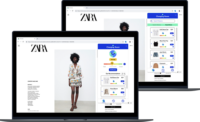
CHANGING ROOM'S
ECO-INDEX
A chrome extension product that empowers users to make more sustainable and conscious fashion choices when shopping online
ROLE
Lead Product Designer
User Researcher
TIMELINE
Jan - May 2021
TEAM
Jeremy Yao, Founder
Michelle Vo, Designer
SKILLS
UI/UX Design
User Research
User Testing
Visual Design
TOOLS
Figma
Adobe Illustrator
PROJECT OVERVIEW
Changing Room is a fashion sustainability technology startup on a mission to help fashion consumers make more eco-friendly shopping decisions.
As the lead product designer, I was tasked to design a Chrome Extension product that would empower people to make more sustainable and conscious fashion choices when shopping online. Through providing environmental transparency on purchases and suggesting lower impact alternatives, our Eco-Index brings us a step closer to democratizing and unlocking education towards conscious consumerism.
PROBLEM SPACE
People want to make more sustainable fashion choices when shopping online, but they don't know where to start. Many individuals are unfamiliar with fashion sustainability and therefore might ask questions like: How can we recognize when a clothing item is "bad?" What exactly makes a garment unsustainable? What types of materials should we avoid? Which brands should I shop at and which brands should I avoid?
With the fashion industry responsible for about 10% of global carbon emissions (source: United Nations Environment Program / Bloomberg News, 2022), our team wanted to find an easy and effective way to help shoppers become more educated and make well-informed eco-friendly online purchases, especially with the continuously increasing domination of fast fashion brands.
SOLUTION / MVP OVERVIEW
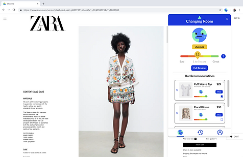
Changing Room's Eco-Index is a Chrome Extension that helps users make well-informed sustainable shopping decisions online. Not only does the Eco-Index rate a garment on a scale from 1-5 (5 being the best) based on several sustainability factors, but it also offers users more sustainable alternatives with their price, Eco-Index score, and a link to view the item on its original website. Additionally, users have the opportunity to learn how their specific garment’s score was calculated by reading about the different sustainability factors that were included in the calculation.
PRODUCT GOALS
-
Educate consumers on fashion sustainability principles
-
Help users make more sustainable and conscious online shopping decisions
-
Provide more sustainable alternatives
-
Easy usability
-
High user engagement
PRODUCT FEATURES
-
Eco-Index item sustainability rating
-
Option for a more in-depth sustainability review
-
More sustainable alternatives with their Eco-Index rating, price, and link to view on original site
-
Saved items
-
Search history
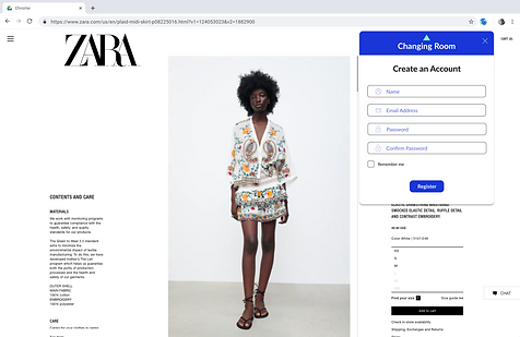

ONBOARDING
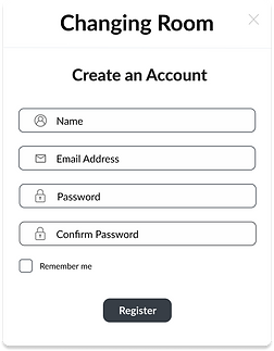
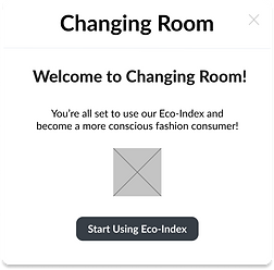
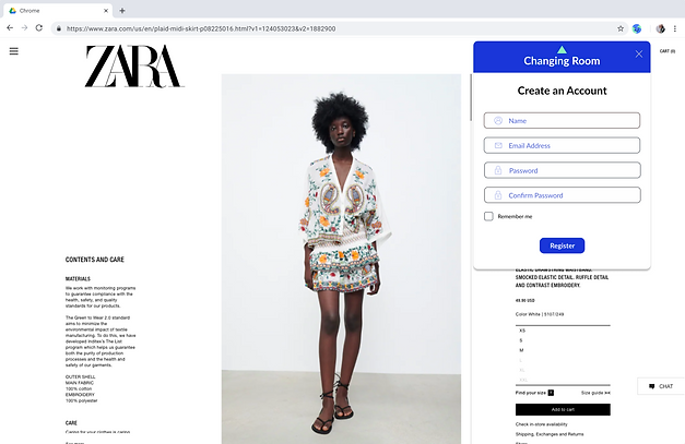
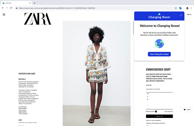
After downloading the Eco-Index from the Chrome Store, users are prompted to create an account.
IMPACT SCORE / HOME
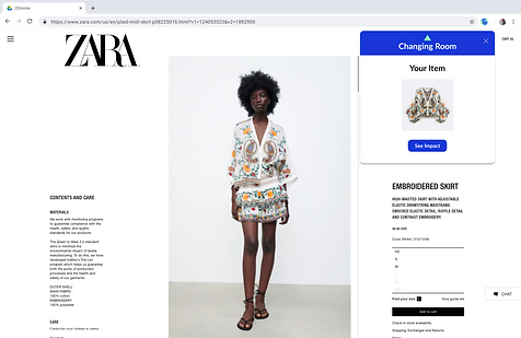
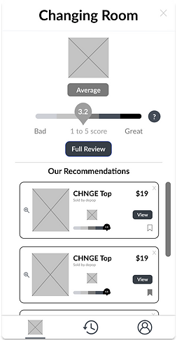
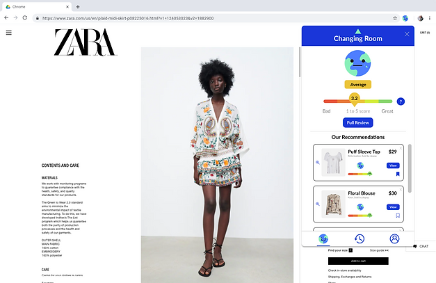
With an option to see a full review, the item is given an impact score that rates the garment's sustainability based on a variety of factors. More sustainable alternatives are recommended, too.
SEARCH HISTORY
& SAVES
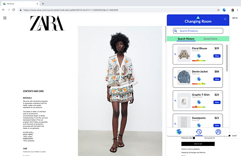
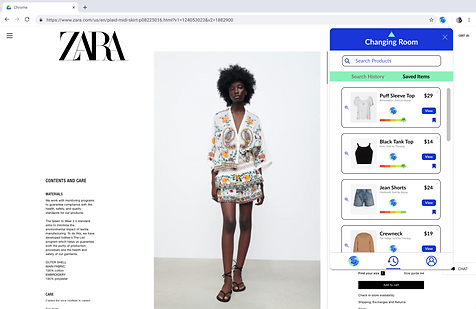
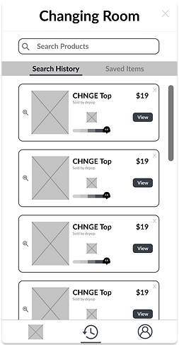
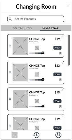
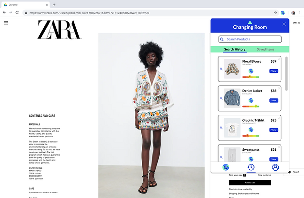
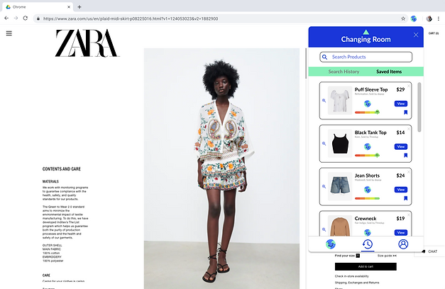
Users can view their product search history, in addition to any recommended items that they saved. Hitting 'View' leads them to the original product detail page.
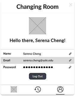
PROFILE
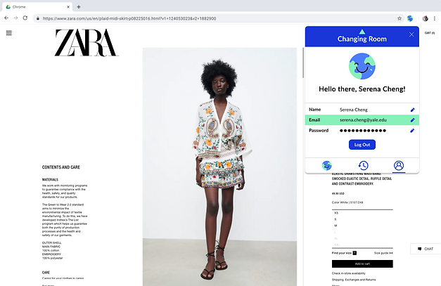
Here, the user's name, email, and password can be edited, along with the option to log out.

BEFORE DESIGNING
AUDITING OUR COMPETITORS
One of the first things I did was look into the current market and conduct a competitive audit of 6 companies' sustainability products in order to better understand the existing landscape. Not only did I look into companies that had a fashion industry focus, but I also examined companies with similar sustainability focuses. For instance, I analyzed two of Changing Room's direct competitors, United By Zero and Beni, but I also looked at indirect competitors like Clear Fashion and Good On You who inform users on brands' sustainability practices. In addition, I took a look at Yuka and Finch, two companies who serve as potential threats, but don't have a fashion industry focus yet.
I audited as much of these companies' products' existing UI and UX to understand what features already exist, what features are lacking, and how the overall journey could be improved upon. After gathering research, I organized this information by creating different categories of features and visualizing whether or not the company fulfilled that need, as shown below:
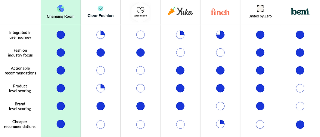
Our goal with the Eco-Index was to offer all of these core features (and more) so that we can inform users on the sustainability scores of both products and brands while also offering actionable recommendations.
OUR TARGET USERS
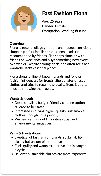
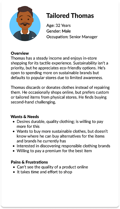
To better understand our target users, our team gathered data through various methods including user interviews, surveys, and market research. Once we had sufficient data, we came together to identify patterns, common characteristics, needs, and pain points among different groups of users. After conducting this data analysis, users were segmented into three distinct groups; three user personas were then created in order to represent each group. This process allowed us to establish a shared understanding of our target audience among project stakeholders while also informing user-centered design decisions throughout the product development process.

DESIGN GOALS
Taking the insights gathered from both our competitive audit and user research, we were able to outline our design goals for the Eco-Index, keeping in mind our desired features and user needs.
Throughout the entire process, from ideation to wireframing to prototyping, I would refer back to these design goals. They served as the pillars of our product and ultimately guided our solutions.
1. MAKE IT SIMPLE & EASY TO USE
Retain necessary functionalities and make the user experience clear and intuitive
2. EDUCATE USERS
Provide useful information on the sustainability of products and brands
3. CREATE AWARENESS
Find ways to highlight the negative impact of fast fashion brands and their garments
4. PROVIDE ALTERNATIVES
Give users more sustainable alternatives that they can explore
Allow users to take action and make more conscious fashion decisions
5. ENGAGE USERS
Create a product that users enjoy interacting with
Figure out how to increase product usage organically
IDEATION
SITE MAP
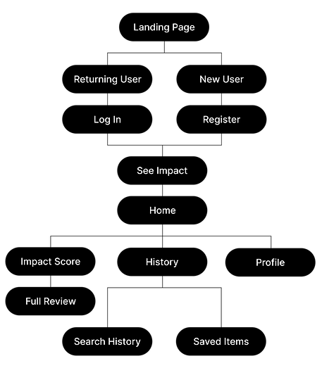
After defining the goals and gaining a stronger understanding of the purpose of the Eco-Index, I went ahead and brainstormed the structure and hierarchy of the Chrome Extension by creating a site map. This visual representation would serve as a blueprint and help me stay organized and attune to the user journeys one could take while moving forward with the design process.
LOW-FIDELITY WIREFRAMES
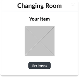
Keeping the design goals, user pain points, and site map in mind, I created low-fidelity wireframes on Figma for the Eco-Index.
I designed various iterations and gained valuable feedback from the rest of my team, eventually landing on this basic version of how the product might look like.

HIGH-FIDELITY WIREFRAMES
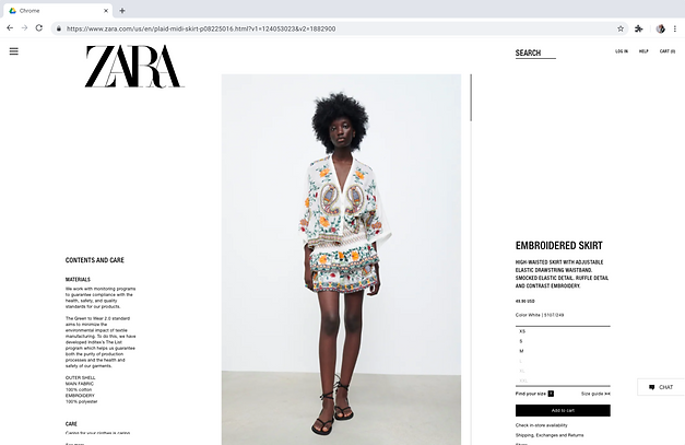
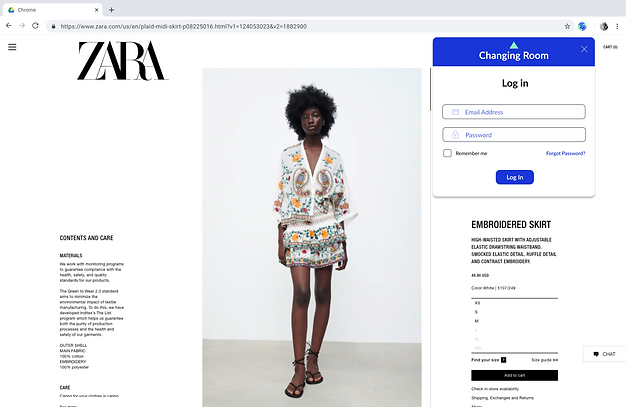
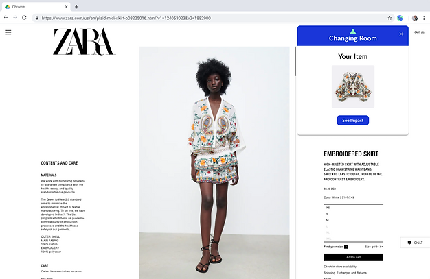
After gaining alignment with the rest of my team, I went ahead and designed high-fidelity mock-ups on Figma.

USER TESTING
After the successful completion of our Eco-Index product's MVP, I conducted user testing interviews through Zoom where I gathered insights and feedback from 30+ users in order to better understand their behaviors, preferences, and perspectives through guided conversations and usability tasks. With the consent of participants, I recorded each session so that notes could be taken regarding their reactions and interactions with the product. Through these user testing interviews, I was able to identify friction points, expectations, and frustrations.
Once I documented my findings from each interview, I looked for patterns, common themes, and discrepancies across participants, capturing both positive feedback and areas for improvement. Then, I used an affinity mapping technique to organize and synthesize this qualitative data so that it was easier for me and my team to digest.
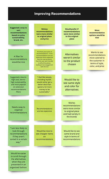
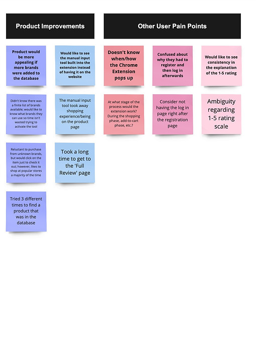
This affinity mapping technique allowed us to identify trends, insights, and actionable next-steps that would improve our product. We noticed a handful of core pain points; these guided our product improvements and next steps below.
NEXT STEPS
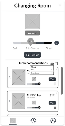
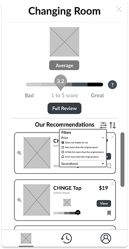
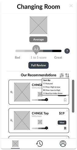
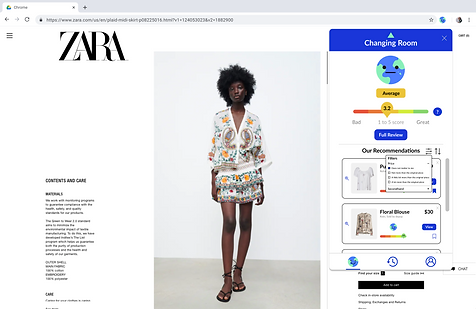
1. ADD A FILTER AND SORT FUNCTIONALITY FOR RECOMMENDATIONS
Many users suggested that we incorporate a way to sort the recommendations, perhaps based on price, sustainability, etc.
Users desire organization and shared that its absence could compromise their engagement with the tool
2. CREATE A BETTER ALGORITHM THAT GENERATES SIMILAR RECOMMENDATIONS IN TERMS OF PRICE & STYLE
Users want to see recommendations that are more similar to their original item's price and style
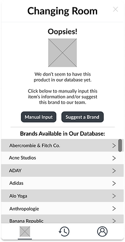
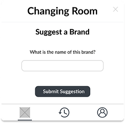
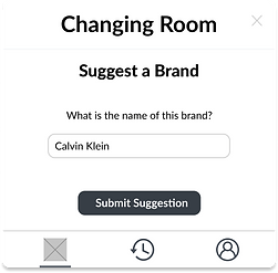
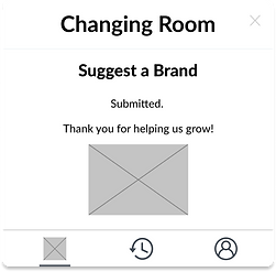
3. FIND A SOLUTION FOR BRANDS THAT AREN'T IN THE DATABASE
Users would find the product more appealing if there was still a way to use the tool if their desired brand wasn't in the database
Users want this solution to be on the extension, itself, not an external webpage
PRODUCT IMPROVEMENTS
I incorporated the above improvements into our product by first creating low-fidelity wireframes, gaining feedback from my team, and then creating high-fidelity mockups. Both are shown below.
LOW-FIDELITY PRODUCT IMPROVEMENT WIREFRAMES


HIGH-FIDELITY PRODUCT IMPROVEMENT MOCKUPS


FILTERING
Users can filter by price and secondhand options.
FILTERING (CONT.)
Users can filter their recommendations by their ideal price points and whether or not they want to see secondhand options.

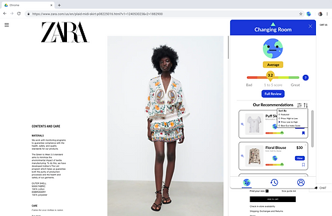
SORTING
Users can sort by featured, price, and Eco Score.
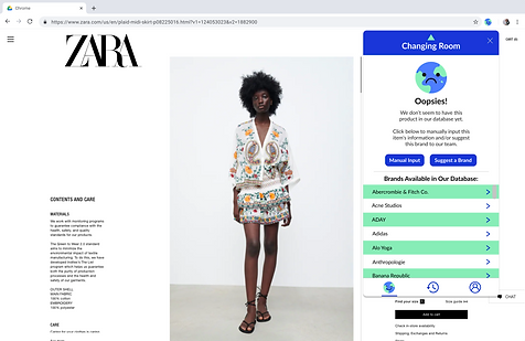
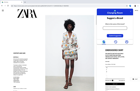
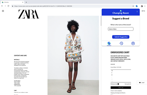
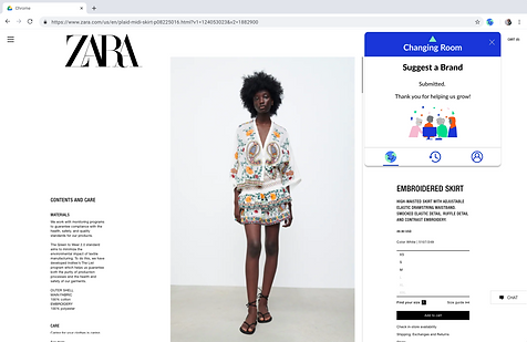
SUGGEST A BRAND
When a product isn't in our database, users have the option to manually input the information and/or suggest the brand to us.
IMPACT
PRODUCT SUCCESS
After launching Eco-Index, we achieved 1000+ downloads and 170+ five-star reviews within two months of releasing on the Chrome Web Store. Our product gained traction and was featured in various news outlets and articles such as Vogue, Product Hunt, Climate Week, and more.
MY THOUGHTS
Working towards fashion sustainability has been and continues to be incredibly challenging yet rewarding. Because a majority of fast-fashion consumers aren’t aware of their impact on the environment and aren’t familiar with sustainable practices, it was certainly difficult to build an intuitive product that could easily educate consumers on their shopping decisions. However, this challenge only motivated me to learn more about how consumers think and what their pain points are when shopping online for more sustainable garments. Our discussions and user testing sessions with 30+ users guided us in making our product roadmaps and applying feedback to design something that served legitimate user needs.
Although our first launch was a success, it is clear that there is still a lot of work to be done to revolutionize the way we shop and facilitate positive sustainable shopping experiences for fashion lovers.
WHAT I LEARNED
-
How to effectively manage the intricacies and ambiguity inherent in projects
-
How to work cross-functionally with engineers, marketing, etc.
-
How to conduct efficient user testing interviews utilizing best practices
-
How valuable user research and feedback is and how to apply these insights to improve the product’s design
-
How to adopt a relentless focus on prioritizing user needs